How to Choose the Perfect Paint Colour to Match Your Wallpaper
One of the most common questions we get asked is: What paint colour works best with our wallpaper? And while we'd love to give a simple answer, the truth is that every room is different! Lighting, decor, and even the time of day can affect how a colour appears on your walls. Here are a few things to consider when choosing the perfect paint to complement your wallpaper.
1. Consider the Lighting in Your Room
Lighting plays a huge role in how colours appear. A shade that looks perfect in a bright, sunlit room might feel completely different in a space with dim lighting. Before deciding on a paint colour, test it in different parts of the room and observe how it changes throughout the day.
Natural light enhances colours but can shift their tone depending on the time of day.
Artificial lighting (warm vs. cool bulbs) can influence how a colour looks at night.
North-facing rooms tend to have cooler light, while south-facing rooms have warmer tones.
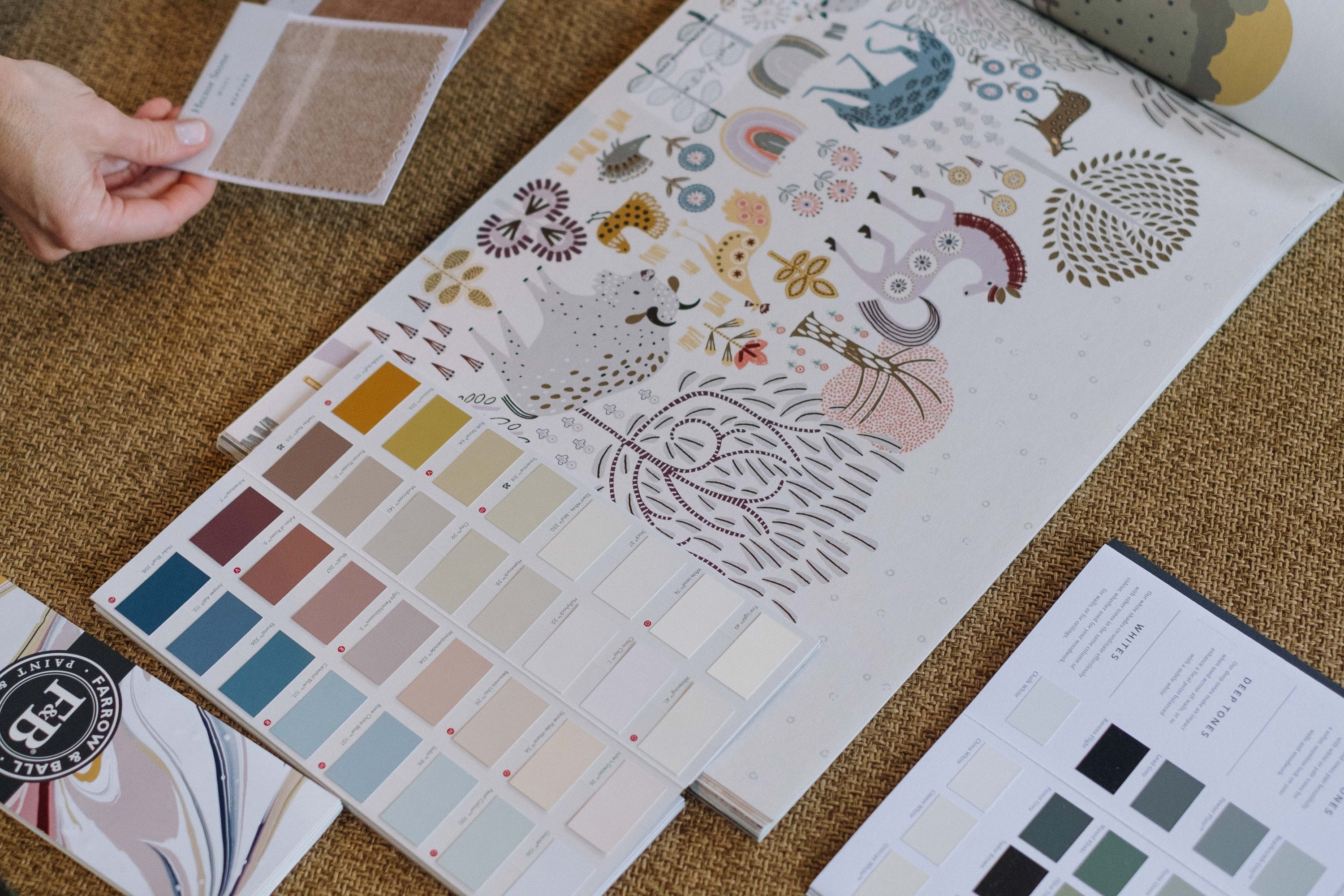
2. Pick a Hue from the Wallpaper
A simple way to create a cohesive look is by choosing a colour from your wallpaper design. Here's how you can do it:
For a seamless, subtle look: Match the paint to the background colour of the wallpaper.
For a bold contrast: Select one of the accent colours to make the wallpaper pop.
For a balanced feel: Go for a lighter or muted version of one of the shades in the design.
3. Think About the Mood of Your Space
Different colours evoke different emotions, so think about how you want your room to feel.
Soft pastels & neutrals create a calming atmosphere, great for nurseries and bedrooms.
Warm earthy tones add coziness, making them ideal for living spaces.
Cool shades like blues and greens bring a fresh, airy feel to a room.
4. Always Test Before You Commit!
Even if a shade looks perfect on a paint swatch, it's essential to test it on your wall first. Paint a few sample patches near your wallpaper and observe them in different lighting conditions before making your final decision.
5. Don't Forget About Trim & Ceilings
White is always a safe choice for trim and ceilings, but you can also experiment with soft greys, creams, or even a colour from your wallpaper for a unique look.
Final Thoughts
There's no single 'perfect' paint colour because every home is unique. The best approach is to test, experiment, and find what works best for your space.
Happy decorating!
This is part of our wider guide to matching paint with wallpaper. You might also like colour psychology in children's interiors, or shop by colour.


